Redesign of food service packaging
Hugo Reitzel
Context
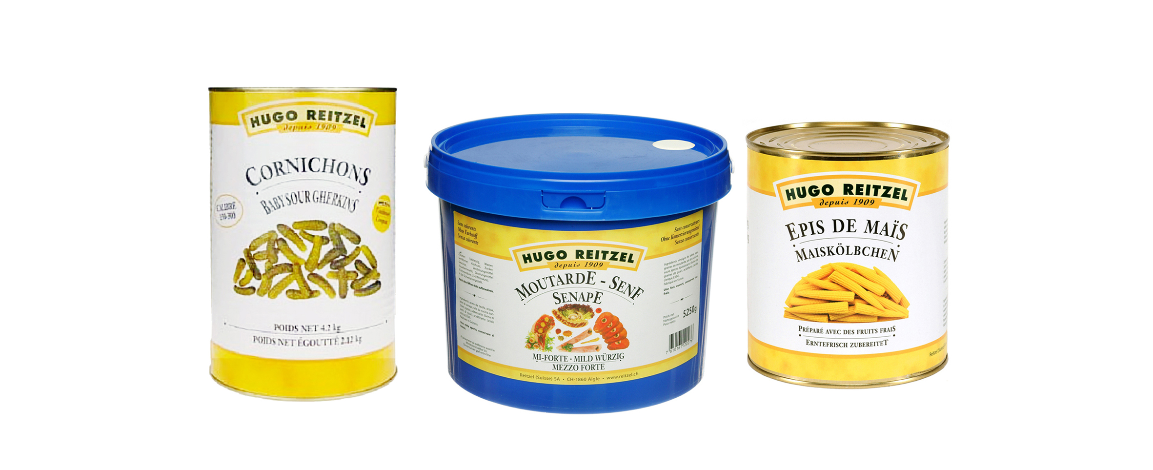
Hugo Reitzel is a historic player in Swiss food service, founded in 1909. Its professional range — designed for restaurant kitchens, hotels and communities — suffered from packaging that communicated neither quality nor desirability.
Moreover, in a sector where purchases are often quick and visual, identifying between references was difficult and the brand image was absent.
Problem → Solution
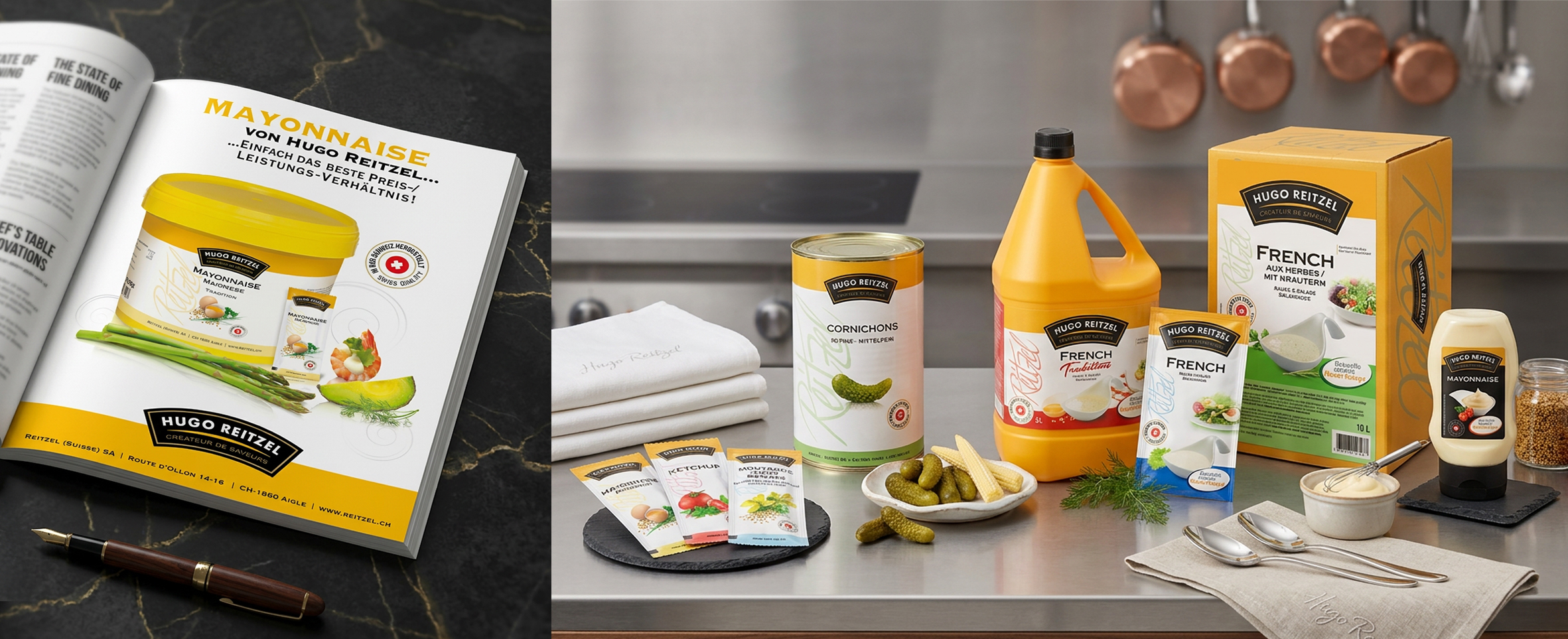
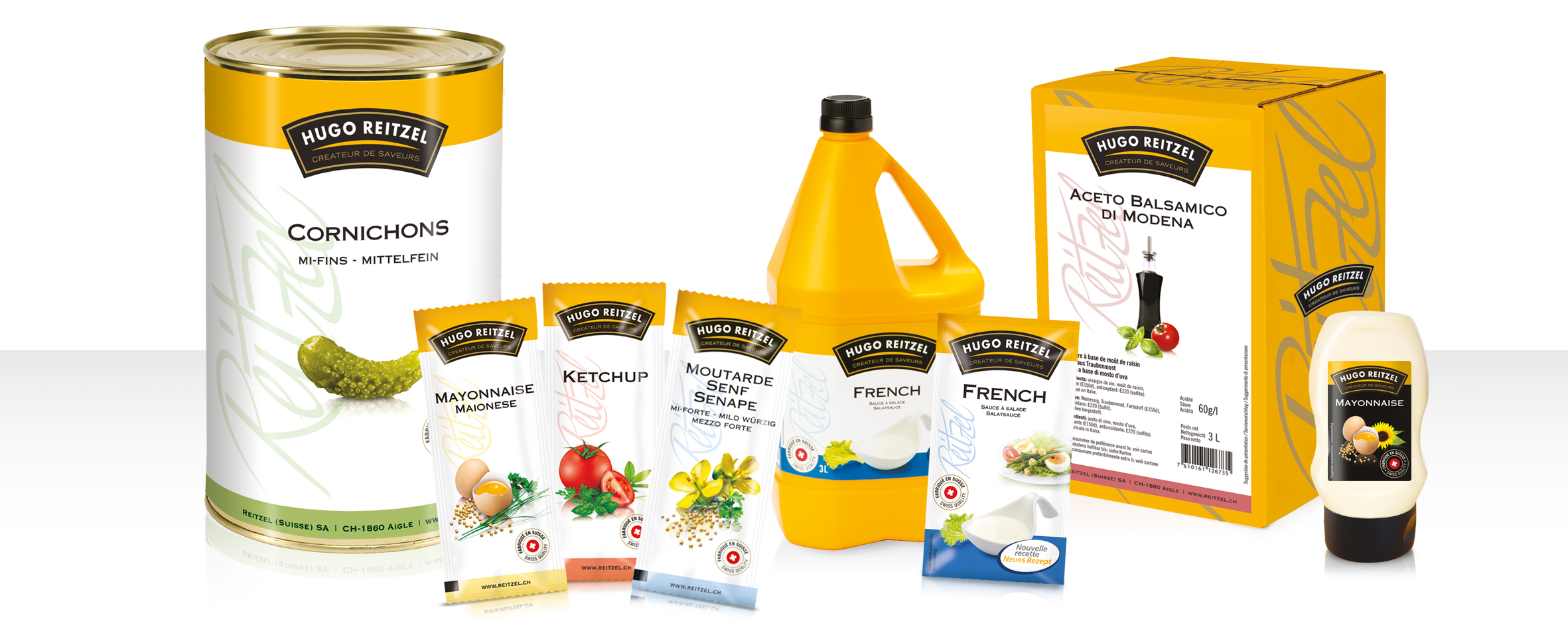
I created a cohesive graphic system that elevates each product visually while ensuring immediate recognition. In professional kitchens, every second counts: the chef doesn’t read a label, they recognize it. The packaging therefore had to work at the speed of a glance — instant product identification.
The redesign was structured around three key graphic decisions:
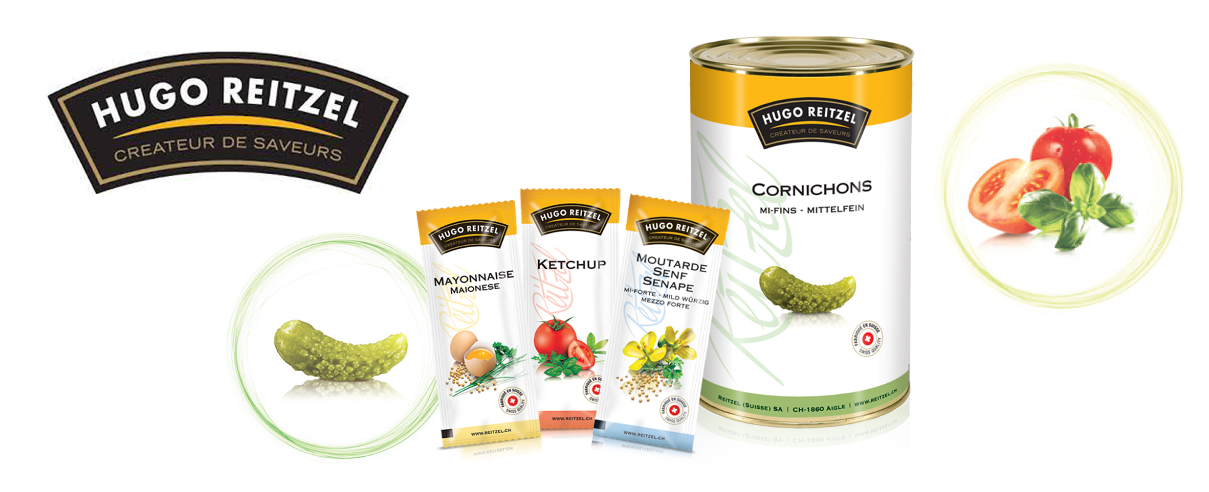
The Reitzel signature in lettering on the side — repositioned as a premium brand marker, it anchors each product in a universe of high-quality craftsmanship.
The ingredient is highlighted like a jewel — with a premium photo and delicate treatment.
Color codes for each product — enabling quick and intuitive identification between references without sacrificing overall visual consistency.
Result
This redesign work transformed functional containers into full-fledged brand supports within a premium and high-quality universe, propelling Hugo Reitzel's Food Service product brand image.
Professionals also particularly appreciated the ease of product identification. Result: a significant increase in sales and an excellent quality image among professionals.